
Colour has a strong impact on our feelings, focus, and interactions within a space. In the workplace, using colour effectively can change more than just the look of an office. It can affect energy levels, teamwork, and overall well being. When applied thoughtfully, colour becomes a practical tool for improving productivity.
At Daniel James Fit Outs, our team incorporates colour into every office fit out and refurbishment project. Here’s why colour is such a useful tool in design.
The Psychology of Colour
Different colours trigger different psychological responses, and understanding these associations is key to designing spaces that perform well.
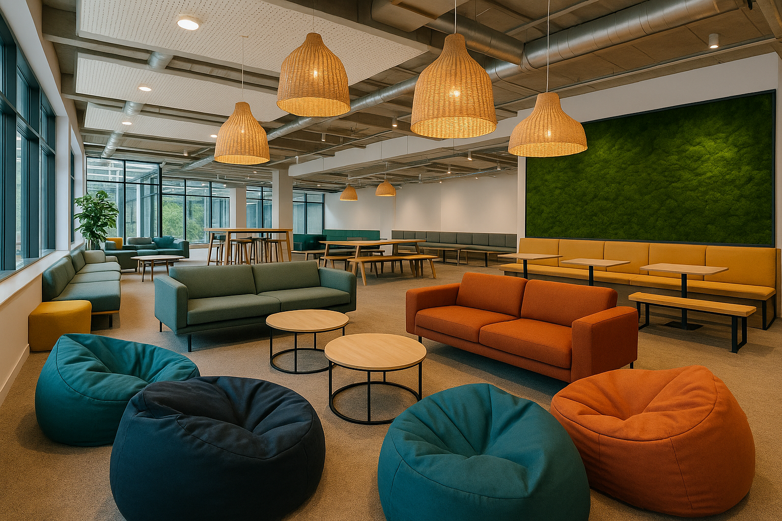
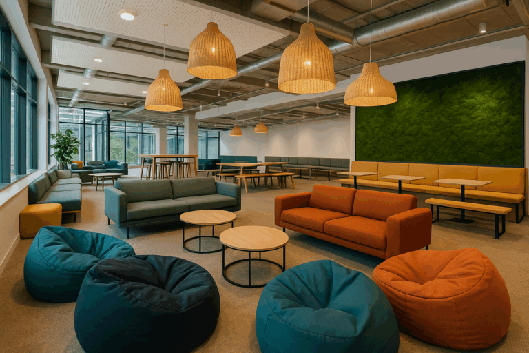
- Blue promotes calm and focus. It’s perfect for areas requiring concentration, like offices, meeting rooms, and reception areas.
- Green connects us to nature and balance. It’s an excellent choice for relaxation areas, helping to lower stress.
- Yellow brings warmth and optimism. When used in moderation, it can spark creativity and positive thinking, perfect for collaborative areas.
- Red energises and draws attention. It should be used carefully, ideal for accents or zones where motivation and energy are needed.
- Neutral tones such as soft greys, whites, and natural wood finishes create a sense of clarity and professionalism. They provide a foundation that other colours can build upon.
When these tones are combined thoughtfully, they can shape the rhythm of an office, supporting both focus and rest throughout the day.
The Business Value of Colour in Design
A well designed colour scheme doesn’t just look good. Studies show that thoughtful design can directly influence employee satisfaction and output. Happier teams are more productive, and customers respond positively to spaces that feel balanced and inviting. Rather than dark and gloomy.
For developers and business owners, investing in colour led design also enhances brand perception. A well considered palette helps communicate your values to clients and visitors before a single word is spoken. Colour can reduce stress, support focus, and create a sense of belonging, all of which contribute to a stronger, more engaging workplace.
Practical Design Tips
A successful colour scheme isn’t about choosing one shade and using it everywhere. It’s about balance, flow, and contrast. Here are a few ways to use colour effectively in modern workspaces:
1. Define zones through colour
Use subtle variations in tone to distinguish different areas of the office. Softer hues can mark quiet zones or meeting rooms, while brighter shades can bring energy to collaborative spaces. This helps people intuitively understand how to use each area.
2. Use colour to enhance natural light
Lighter tones reflect sunlight, making a space feel larger and more open. In darker offices, warmer neutrals and soft whites can brighten the atmosphere without relying on harsh artificial lighting.
3. Add personality through furniture and accents
Not every design change requires painting walls. Colour can come through furniture, upholstery, artwork, or flooring. This adds flexibility, allowing spaces to evolve as teams or branding change.
4. Keep consistency across brand identity
Aligning your colour palette with your company branding creates cohesion between your physical and digital presence. Visitors should feel that the environment reflects the business they’re engaging with.
5. Balance energy and calm
Too much of any strong colour can overwhelm a space. The best office designs pair energising accents with calmer backdrops, giving the eye a place to rest and helping teams maintain focus throughout the day.
Balancing Aesthetics and Function
While colour is important, it should always serve the wider purpose of the workspace. A well designed office isn’t just beautiful, it’s functional, adaptable, and aligned with how your business operates.
That balance comes from understanding how employees use each part of the space. Meeting rooms benefit from tones that encourage clarity and communication, while quiet work zones perform best with cooler, more subdued palettes. Communal areas can handle richer colours that build energy and connection.
When aesthetics and practicality work together, colour enhances productivity instead of distracting from it. Choosing the right colours for your workspace is about more than preference; it’s about understanding how design affects behaviour. At Daniel James Fit Outs, we craft interiors that reflect your brand identity while improving the everyday experience for your team.
How Daniel James Fit Outs Uses Colour in Fit Outs
Every project we deliver starts with a conversation. We work closely with talented designers to bring every fit out to life. We take time to understand your brand, your team, and how your space will be used. From there, we develop palettes that not only look right but work right.
Bringing It All Together
Our approach combines fit out, construction, and furniture under one roof, ensuring that every element, from the walls to the lighting and furnishings, works together seamlessly. Whether you’re updating an existing office or creating a new one, we’ll help you choose a palette that fosters focus, creativity, and balance in the workplace.
Colour can influence how people think, feel, and perform. With skilled design, this power can be used to create workspaces that truly work.
Speak to the team at Daniel James Fit Outs about your next project, and let’s build a space that inspires productivity, supports wellbeing, and reflects the character of your business.

